Oobi x Nero Whyte: A Whimsical Footwear Tale
Brand Identity
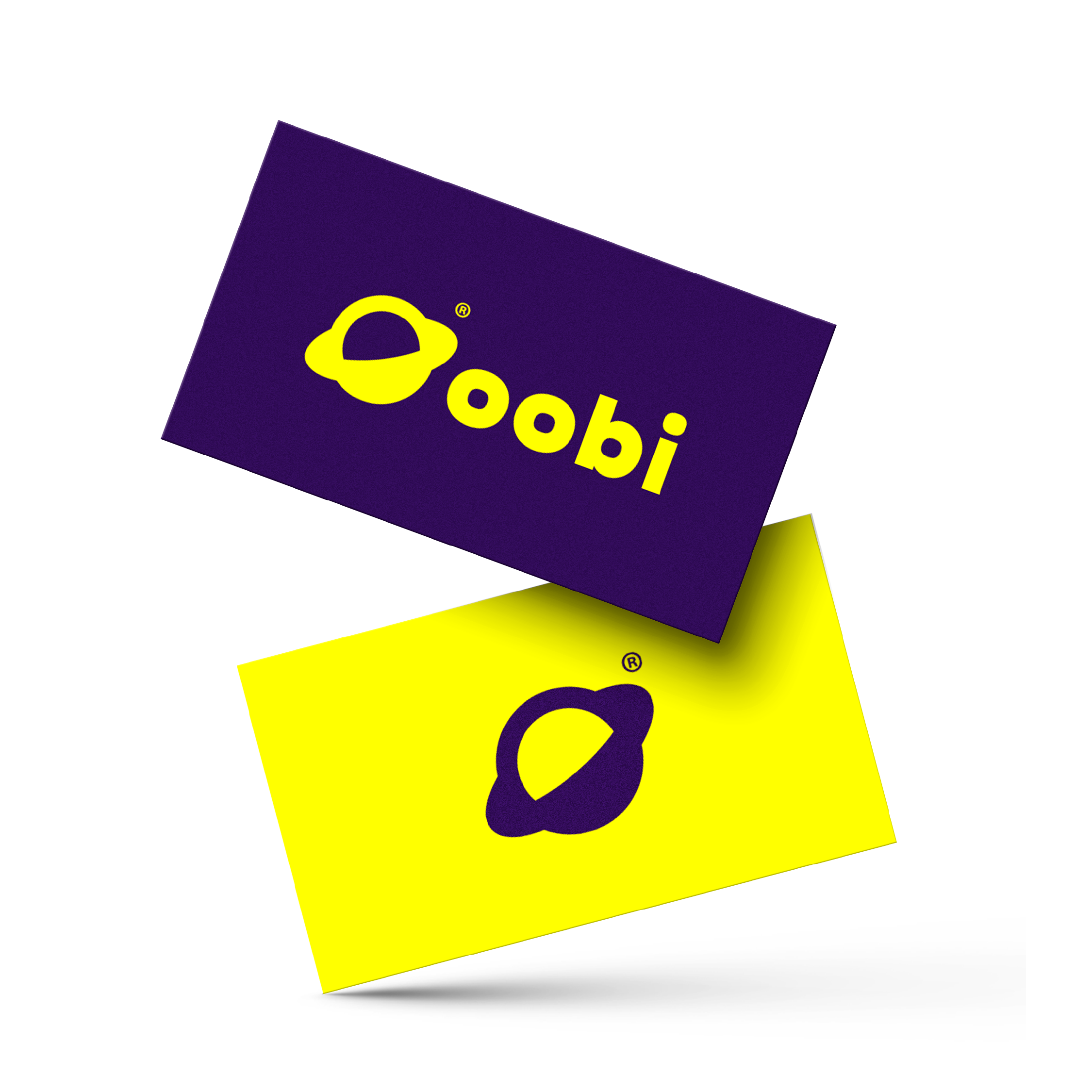
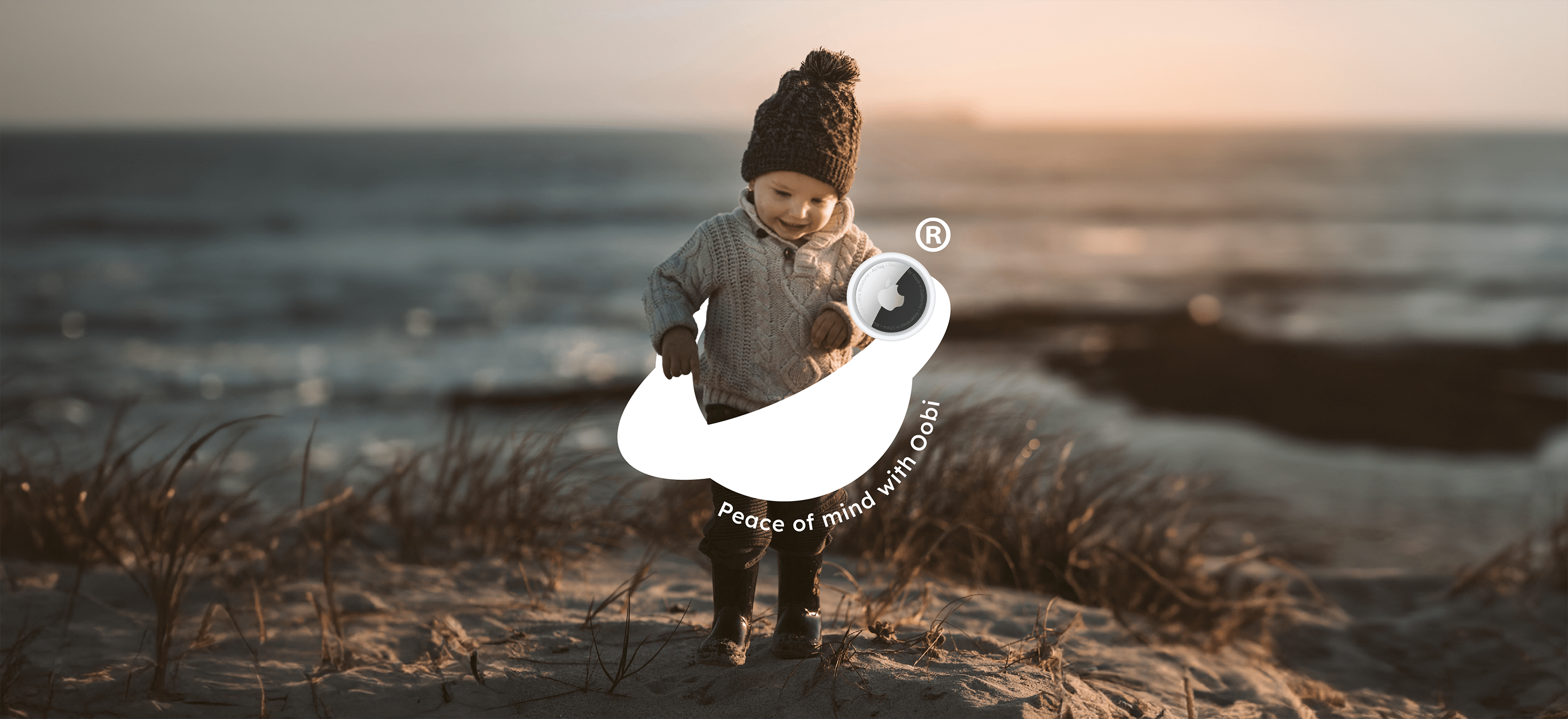
At Oobi, kids are the shining stars of the universe, and safety is Oobi’s North Star. With a sprinkle of imagination and a dash of innovation, they have crafted shoes that are not just footwear but gateways to enchanted realms. Oobi’s Apple AirTag compatible shoes let little explorers roam free, while parents can play the role of cosmic guardians with ease.

The Mission
🪐 Establishing a strong brand identity that communicates Oobi’s values of safety, quality, and adventure.
🪐 Creating a cohesive visual identity that reflects the brand’s ethos while showcasing the innovative features of the AirTag compatible shoes.
🪐 Generating excitement and anticipation for the new product launch within Oobi’s target audience.
The Moves
Brand Discovery 🔭
Nero Whyte conducted research to understand Oobi’s brand values, target audience, and market positioning. Through this process, key brand attributes such as safety, innovation, and adventure were identified to inform the brand identity strategy.
Visual Identity Development 🎨
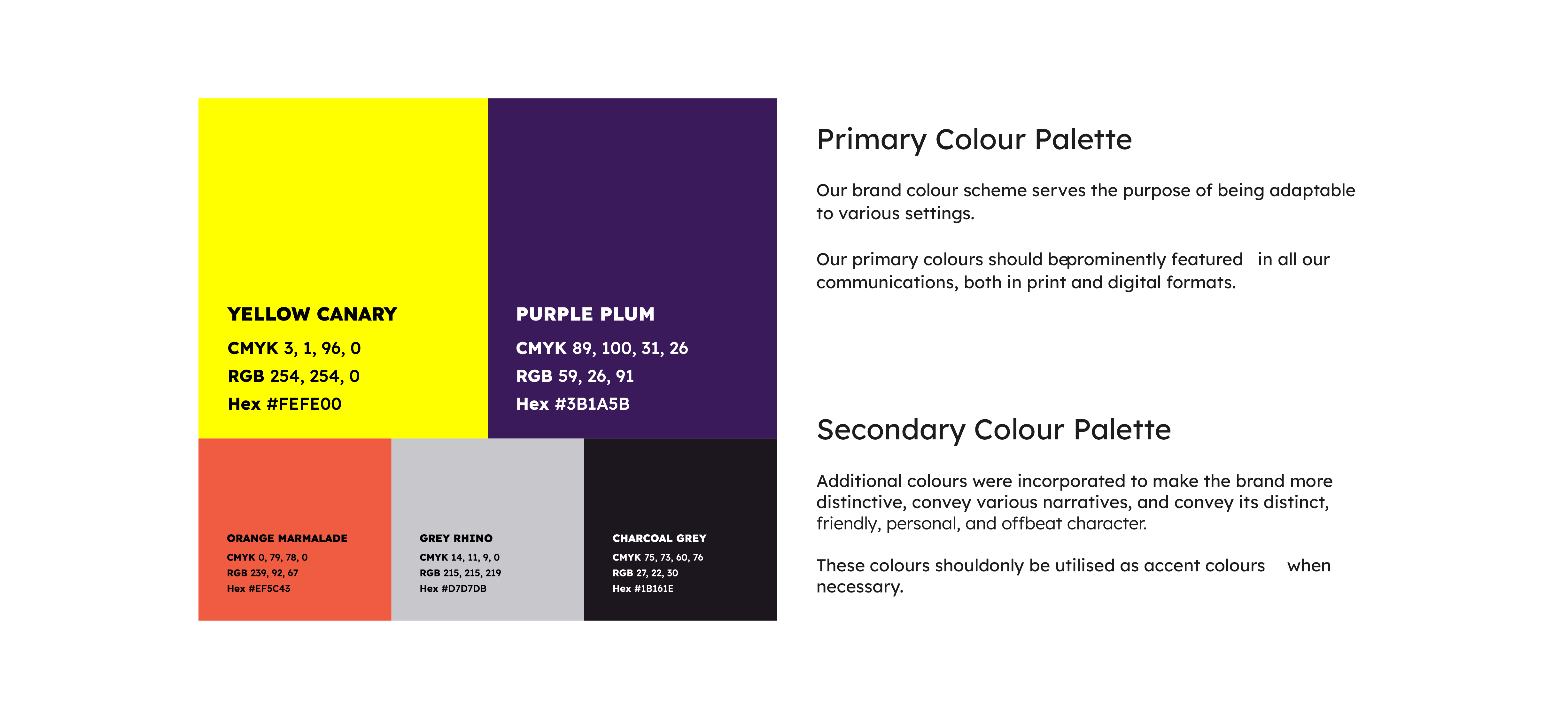
Developed a vibrant and playful visual identity that resonates with both children and parents, integrated elements of adventure and technology to highlight the innovative features of the AirTag compatible shoes, and created a versatile logo and colour palette that reflects Oobi’s brand personality across various touch-points.

The Results
Nero Whyte was key in shaping Oobi’s brand identity. This strategic branding work was central to the launch of this new line of kids’ shoes within the American market.
Oobi are building a community whilst helping parents everywhere feel confident in their choice for quality, safety, and adventure for their little ones! We’re proud to have played our part in this great project 🪐
Let our clients do the talking…
Dig deeper and discover similar projects we’ve worked on.
